
Polytonic Greek's Dual Encoding
 They say a picture is worth a thousand words. I am going to try this again. For some people the difference between Wayne's posting and my posting is about how many times the woman submits. I will submit this one more time.
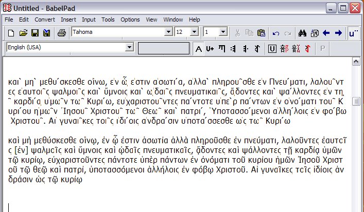
For others the difference is in the text, majority text versus the UBS text. For others again they may focus on the Tahoma font, which I use for this demonstration because I know it has the necessary range for combining diacritics.
For me, the difference is in the Unicode character sets. These are two different encodings. The first came from a source which Wayne has accessed but I don't know what that source is. Mine is from the Online Greek Bible at greekbible.com (Zhubert is the same as this.)
My guess is that the second, the precomposed Polytonic Greek text, is the standard, and that the first one, decomposed text (with combining diacritics), is not the standard. I have discussed this many times with Unicodies. They wish to promote the first encoding with combining diacritics. I persist in the belief that the precomposed text has more circulation.
The precomposed text can be easily represented with Palatino Linotype. The combining diacritics text falls prey to font substitution in Mozilla and looks wonky, while it usually displays with missing glyphs in some browsers. It is simply harder to predict.
However, with the proliferation of software on the market I think that this discussion is not negligible. I would like to hear from people whether precomposed is definitely the way to go or not. I have no access to any products other than what is freely available on the internet, so I would like to have someone who works in Polytonic Greek software development comment on this.
Otherwise some of us are going to be staring at missing glyph boxes for some time. My personal recommendation, for what it is worth, is to use a precomposed (precombined accents) text with Palationo Linotpe as a defined font. Of course, it could be defined as a font family or font class as well or done in CSS, and I can't say exactly how this code would be written.
Thanks, Peter, for the links to Zhubert et al. I hadn't seen that page before. You have answered some of my questions but I will post this illustration anyway so people can see the difference between the two. Please click on the image above to view how the two encodings look in their decomposed state.
γενέσεως Ἰησοῦ Χριστοῦ This is the Perseus' Westcott and Hort text. Perseus has not defined the font but it doesn't matter. If I cut and paste from it and then define the font myself it displays fully.
Update: I neglected to link to the Westcott and Hort text at Perseus.
posted by Suzanne McCarthy at 3:20 PM
![]()
![]()

4 Comments:
For some people the difference between Wayne's posting and my posting is about how many times the woman submits. I will submit this one more time.
Oh, that is very funny, Suzanne!
The first came from a source which Wayne has accessed but I don't know what that source is.
I copy-pasted from the WH (Westcott-Hort) text in the e-sword Bible program.
Thank you, Suzanne. Your example seems to indicate that precomposed is the way to go. It certainly gives the more predictable results as long as the right font is available.
I don't think it is true that the "Unicodies" "wish to promote the first encoding with combining diacritics." They certainly do not for the Internet, which is what we are mainly talking about here, for which precomposed (NFC) is the agreed preference. What they do want to promote is software (including fonts) which treats the two "canonically equivalent" forms as identical. Unfortunately we are a long way from that ideal now.
I understand, if I remember correctly, that Microsoft has said that they will include precomposed polytonic Greek in their base fonts e.g. Times New Roman, Arial in the next edition of Windows, which I think was supposed to be due this year but I don't know the latest.
What they do want to promote is software (including fonts) which treats the two "canonically equivalent" forms as identical. Unfortunately we are a long way from that ideal now.
Peter, I have been around the block on this with a Unicode promoter. Andrew West, the maker of Babelpad, was able to help me prove that the canonical equivalent ideal is just that, an ideal, as you say. So the reality is that precomposed is better.
Microsoft Sans Serif font does support Polytonic Greek, but I was not sure that everyone would have it.
The irritationg thing about that font is that the chi does not descend below the line.
Post a Comment
Subscribe to Post Comments [Atom]
<< Home